Look at one historical poster for letter shapes rather than its message
An archival poster can become a short visual observation instead of another page to read deeply. Choose one suitable example and look at its letter shapes, spacing and relation to the image. This original activity borrows a viewing subject from a primary collection while keeping your small response separate from the poster’s historical claims or advertising message.
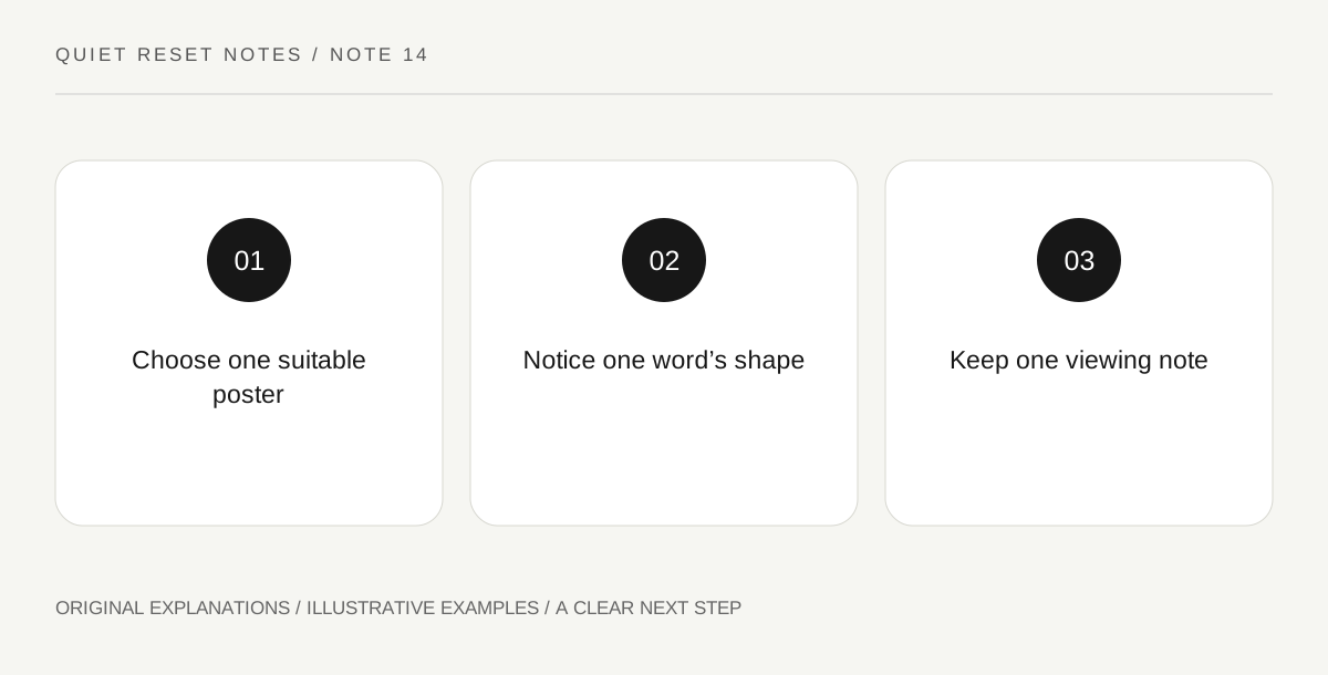
Original explanatory diagram. Read the full method and limitations below.
Choose a comfortable item to view
The Library of Congress Poster Parade presents historical posters across different subjects and periods. Choose an item whose subject suits you, then read enough of its record to know what you are viewing. Skip disturbing or uninviting material without treating the selection as a research duty. Use a readable display or an existing permitted reproduction; there is no need to buy a print. The session concerns visual noticing, not endorsing an old political, commercial or health message.
Find one word’s visual identity
Choose a prominent word and observe its broad letter qualities. Are the forms narrow or wide, upright or leaning, densely packed or generously separated? Describe what is visible without guessing the typeface’s exact name. You can make a few abstract marks that echo width or spacing instead of copying the full word. Keep the observation small. The aim is to notice a design choice that might otherwise disappear behind the poster’s overall message.
Compare the letters with the surrounding space
Look at how the word sits beside an image or an open area. Notice whether it seems to gather the composition, point somewhere or create a boundary. These are your visual descriptions, not documented claims about the artist’s intention. If you want a paper response, write an unrelated neutral word of your own with a different spacing. Do not imitate the poster’s message or reproduce a long passage simply to complete the exercise.
Keep a one-line viewing note
Record the item title or link and one observation, such as wide letters above an open image area. A later reader can distinguish that personal observation from the collection’s catalog information. Stop with one poster rather than scrolling until a perfect example appears. You can choose another subject in a future session. The archive supplies a specific thing to look at; the leisure activity does not require completing the collection, identifying every font or becoming an expert in its history.
An illustrative small session
In an illustrative viewing session, a reader chooses an appropriate poster from the collection and notices a large word with generous gaps between letters. They write the neutral word window on scrap paper with two different spacings, then save one short observation and stop. The example names no actual poster content and makes no claim about an artist’s intention or an effect on mood.
Questions that come up
Do I need to agree with the poster’s message?
No. You can observe design without endorsing the content. Choose a different item if the subject is uncomfortable, and do not repeat a historical claim as present-day guidance.
Must I identify the exact typeface?
No. Ordinary descriptions such as narrow, wide or closely spaced are enough. The activity is a small observation, not a typography examination or a complete historical analysis.
References and scope
These sources support the factual background. Examples and exercises are original illustrative teaching material. References do not imply endorsement.
- Library of Congress — Poster Parade — A primary collection for observing historical poster composition; individual records supply context.